Australia is known for our immense solar resources. We have more residential installed solar than anywhere in the world with solar on 31% of our homes[1]. But what has been the effect of so much residential and utility scale solar production on our electricity markets? There is a lot of hype around the price impact of the flood of solar power generated through the day. For the market, this effect is known as co-variance risk - the risk that the spot price for power will be depressed if all variable renewable energy generators in a given region have the same or similar load profile and therefore produce at the same time whilst demand remains constant. So what is the reality? In this article we explore the issue and provide insights for prospective renewable energy generation investors from our daily observations of the market.
How much is true?
In general, prices for solar-backed Power Purchase Agreements (PPAs) are lower due to their specific load profile. These profiles correlate with that of the ever-growing rooftop solar asset class which has the impact of reducing demand for grid supplied power. In areas of high solar penetration, such as the South Australian market we see extremely low (or negative) prices in the middle of the day as shown in Figure 3. The comparison in Figure 2 is wind and solar generation on a single summer day in South Australia, compared to spot price outcomes. Over this particular day, production weighted average price for wind is approximately $55/MWh above solar.
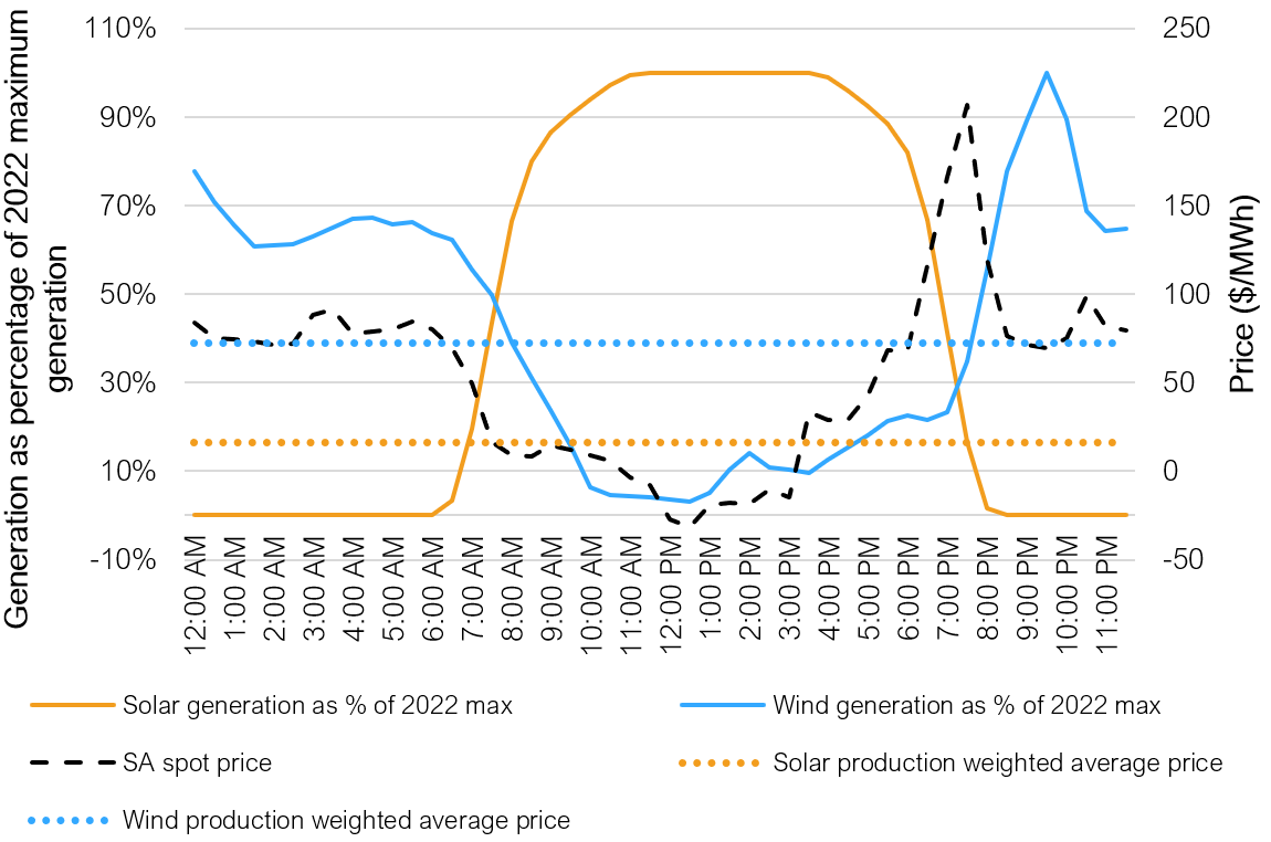
Figure 1: Illustration of covariance risk by technology type for a single day in South Australia
Not just solar
However, whilst there is greater variability in the generation profile of wind assets, negative prices and covariance risk are not limited to solar. In fact, negative prices have become increasingly common across all National Electricity Market (NEM) regions as summarised in Figure 2 below.
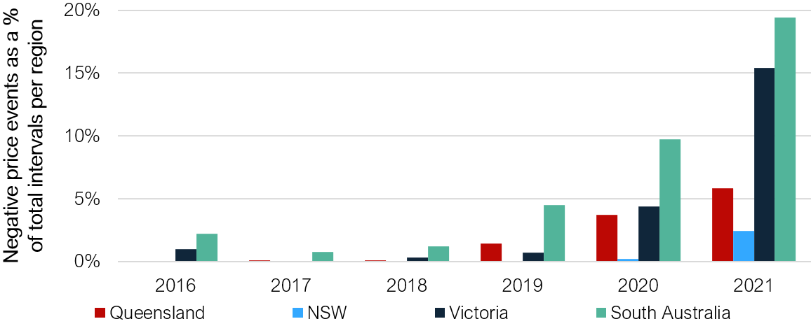
Figure 2: Frequency of negative price intervals across NEM regions since 2016
There is a clear and consistent correlation between the increased prevalence of variable renewable energy sources and negative price events. The table below illustrates the percentage contribution of wind and solar in South Australia, Victoria, NSW and Queensland since 2016 during negative price intervals. What we see in Table 1, for states in which negative price intervals are most prevalent (South Australia and Victoria), wind generators are in fact the biggest losers from these events.
Table 1: Average percentage contribution by wind and solar to jurisdictional supply
|
|
SA – Solar |
SA - Wind |
VIC - Solar |
VIC - Wind |
NSW - Solar |
NSW - Wind |
QLD - Solar |
QLD - Wind |
|
2016 |
0.00% |
68.75% |
0.00% |
12.11% |
N/A |
N/A |
0.00% |
0.00% |
|
2017 |
0.00% |
62.14% |
0.00% |
7.35% |
N/A |
N/A |
0.08% |
0.00% |
|
2018 |
1.29% |
62.99% |
0.12% |
18.33% |
N/A |
N/A |
3.73% |
0.80% |
|
2019 |
5.02% |
61.55% |
2.07% |
20.43% |
5.09% |
4.42% |
10.38% |
0.79% |
|
2020 |
8.95% |
53.94% |
3.40% |
18.55% |
9.56% |
7.88% |
13.90% |
2.17% |
|
2021 |
13.94% |
55.77% |
6.57% |
23.72% |
17.45% |
10.21% |
13.42% |
2.14% |
Risk of revenue degradation
Negative pricing can have a big impact and renewable energy asset owners can experience degradation in their revenue. The challenge is illustrated in Figure 3 which compares the average production weighted average prices[2] realised by wind and solar, to average spot market prices.
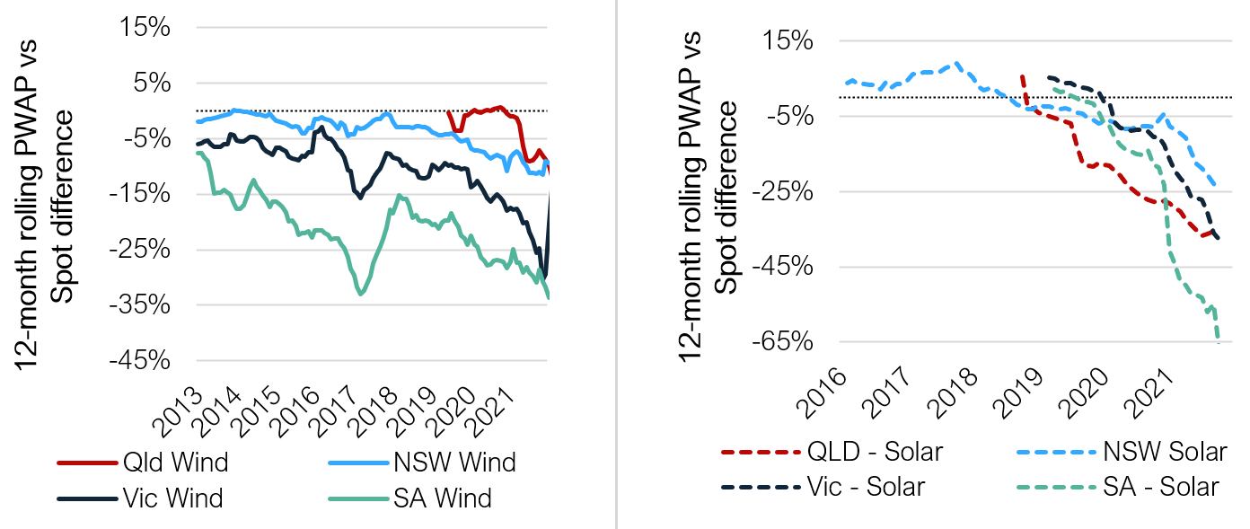
Figure 3: Monthly Production Weighted Average Price (PWAP) for wind and solar projects compared to average monthly spot price outcomes
What we see is that with more renewable generation, the covariance risk for the underlying asset increases – leading to an erosion in the value of the energy generated.
What should renewable energy generation investors look for?
Investors should be aware that there is significant variability even within the same technology type. Plant location, for example, has a considerable impact on the volume of output and the generation profile of projects, which can result in large variations in the prices realised by different generators.
Energetics works with investors and renewable energy generators to develop clean energy portfolios that are better able to resonate with corporate offtakers' needs and achieve target returns. We provide deep market insights and robust quantitative risk analysis to demonstrate the financial impact of market dynamics and changes on energy portfolios, while defining hedging strategies to manage market and operational risks. Please contact our Energy Markets team or any of the authors for further insights and advice.
[1] Powermag | A Global Look at Residential Solar Adoption Rates
[2] Production weighted average prices (PWAP) represents the average $/MWh price that a renewable generation asset realises in revenue from the wholesale spot market when the asset is producing.
Get our thought leadership directly to your inbox
Keep up to date with the latest insights on net zero, climate resilience and clean energy transition.